

Designing effective Splunk dashboards involves creating a layout that provides clear, actionable insights while ensuring the dashboard is user-friendly and visually engaging. By applying dashboard design best practices, users can optimize data visualization software and enhance their decision-making processes. Effective dashboard design principles include simplicity, clarity, and interactivity, ensuring that data is presented in an easy-to-understand format. Leveraging interactive data visualization techniques helps users explore data in real-time, improving user experience (UX). Effective Splunk dashboard design combines simplicity, clarity, and interactivity. Integrating test automation and cloud testing ensures reliability and functionality across environments, enhancing decision-making and user experience. This article covers essential strategies for dashboard design, visualizing data effectively, and configuring your Splunk software to create intuitive and efficient dashboards.
What’s next? Keep reading to discover:
🚀 Why Good Design Matters – How Splunk dashboards enhance decision-making.
🚀 Choosing Visualizations – Selecting the right data visualization tools.
🚀 Dashboard Layout Best Practices – Optimize for speed and clarity.
🚀 Configuring Dashboards – Improve Splunk performance, interactivity, and scalability.
🚀 Avoiding Common Mistakes – Prevent key dashboard design and performance issues.
Introduction to Splunk Dashboards
Splunk dashboards offer powerful visualization and data analysis capabilities, making it easy for businesses to monitor and analyze large sets of data in real-time. By following dashboard design principles, these dashboards not only enhance the user experience but also streamline decision-making processes with key data insights.
Key Features:
- Interactive Visualizations: Use advanced data visualization tools to create dynamic charts, graphs, and maps that provide a comprehensive view of the data.
- Customizable Templates: Tailor your dashboard design templates to meet specific business requirements, ensuring that each dashboard is relevant and effective.
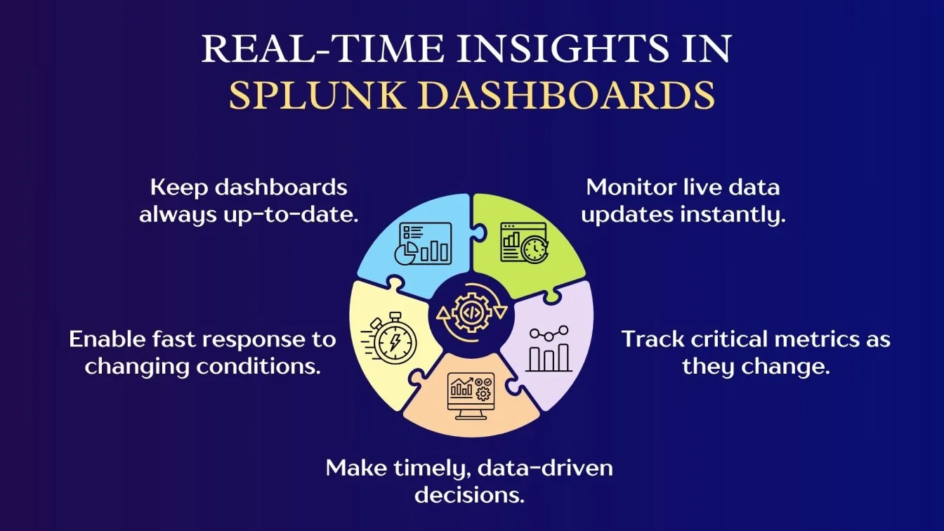
- Real-Time Insights: With Splunk’s robust visualization software, you can access live data updates and monitor critical metrics in real time.
- Improved User Experience: A well-organized and intuitive dashboard layout enhances user experience design, making it easier to navigate and understand complex datasets.
- Data Integration: Integrate multiple data sources seamlessly into a single dashboard, providing a unified view for improved analysis.
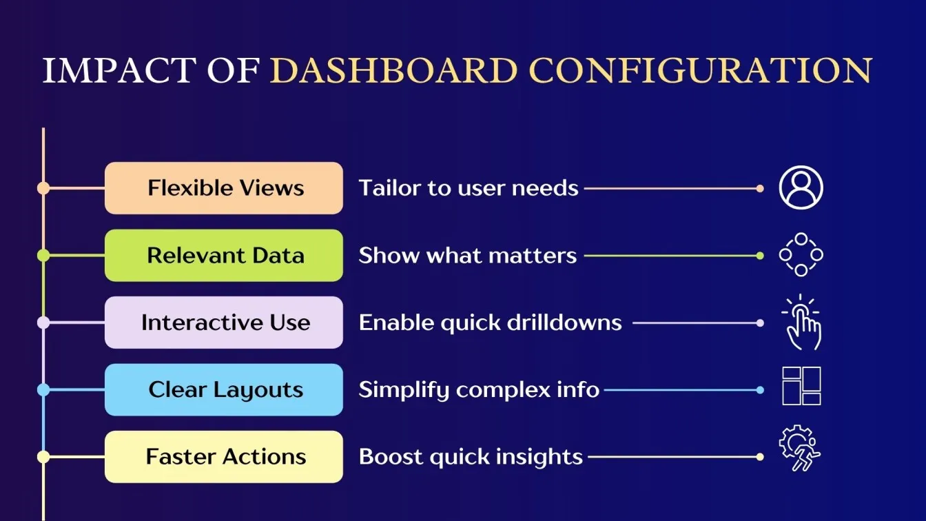
Why Good Dashboard Design Matters in Splunk
A well-designed dashboard is essential for unlocking the full potential of Splunk. It ensures that users can easily access, interpret, and act on data in real time, which is crucial for making fast, informed decisions. Good dashboard design not only improves user experience but also optimizes the overall functionality of the system.
Why It Matters:
- Improved Usability: Clear and organized dashboards make it easier for users to navigate and find relevant data quickly.
- Faster Decision-Making: With intuitive visualizations, users can quickly interpret complex data and make decisions faster.
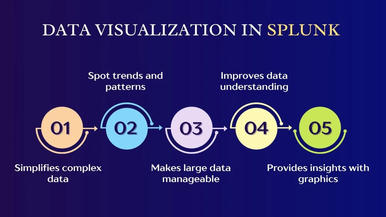
- Enhanced Data Visualization: Proper design ensures that even complex data is represented clearly, making trends and insights easier to spot.
- Boosted Efficiency: Well-structured dashboards reduce the time spent searching for data, helping users focus on what matters most.
- Optimized for Splunk Cloud: In cloud environments, optimized data dashboard design ensures seamless user interaction and real-time monitoring, improving performance.
Choosing the Right Visualizations in Splunk
Selecting the appropriate visualization in Splunk is crucial for presenting data effectively. The right visualization type enhances data comprehension, helping users make informed decisions quickly. Depending on the nature of the data, different charts like bar charts, pie charts, and gauge charts can be used to highlight trends, proportions, and performance against thresholds, respectively. This ensures that insights are clear, concise, and actionable for users.
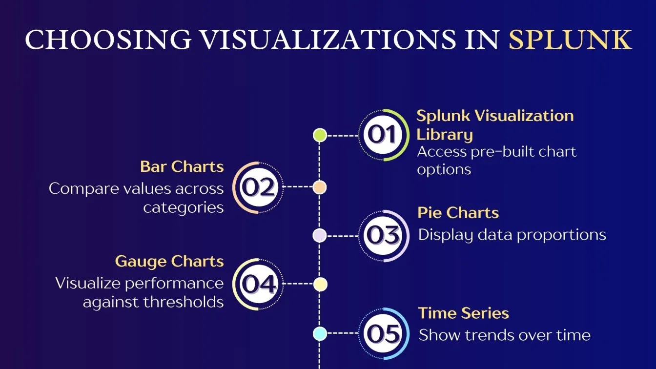
When to Use Bar Charts for Comparison Over Time
Bar charts are an excellent choice when you need to compare data across different categories. They provide a straightforward way to visualize changes in values over time, making them ideal for tracking metrics like sales, traffic, or performance.
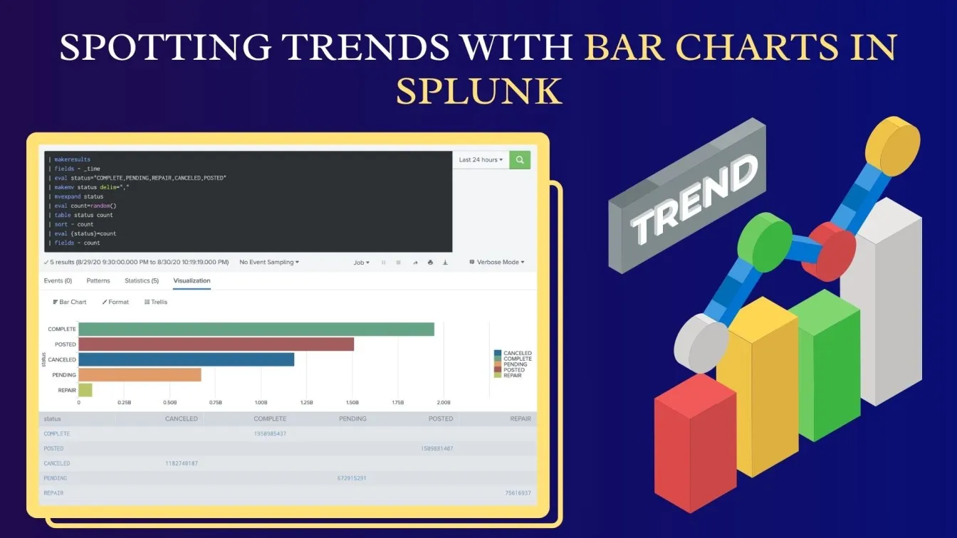
Why Use Bar Charts?
- Easy Comparison: Bar charts offer a clear, side-by-side comparison of values, making trends and differences easy to spot.
- Time-Based Analysis: They are perfect for displaying data over a consistent time frame, such as days, months, or years.
- Categorical Grouping: Bar charts help compare distinct categories, such as different regions or customer segments.
In Splunk
Bar charts are useful for monitoring system performance, analyzing website traffic, or comparing sales metrics. They provide clarity in identifying spikes, trends, or drops, making it easier for users to understand the data quickly and make informed decisions based on time-based comparisons.
Ideal Use Cases for Pie Charts in Splunk Dashboards
Pie charts are ideal for representing proportional data, showing how different parts contribute to a whole. They are especially useful when you want to visualize relative percentages or parts of a dataset.
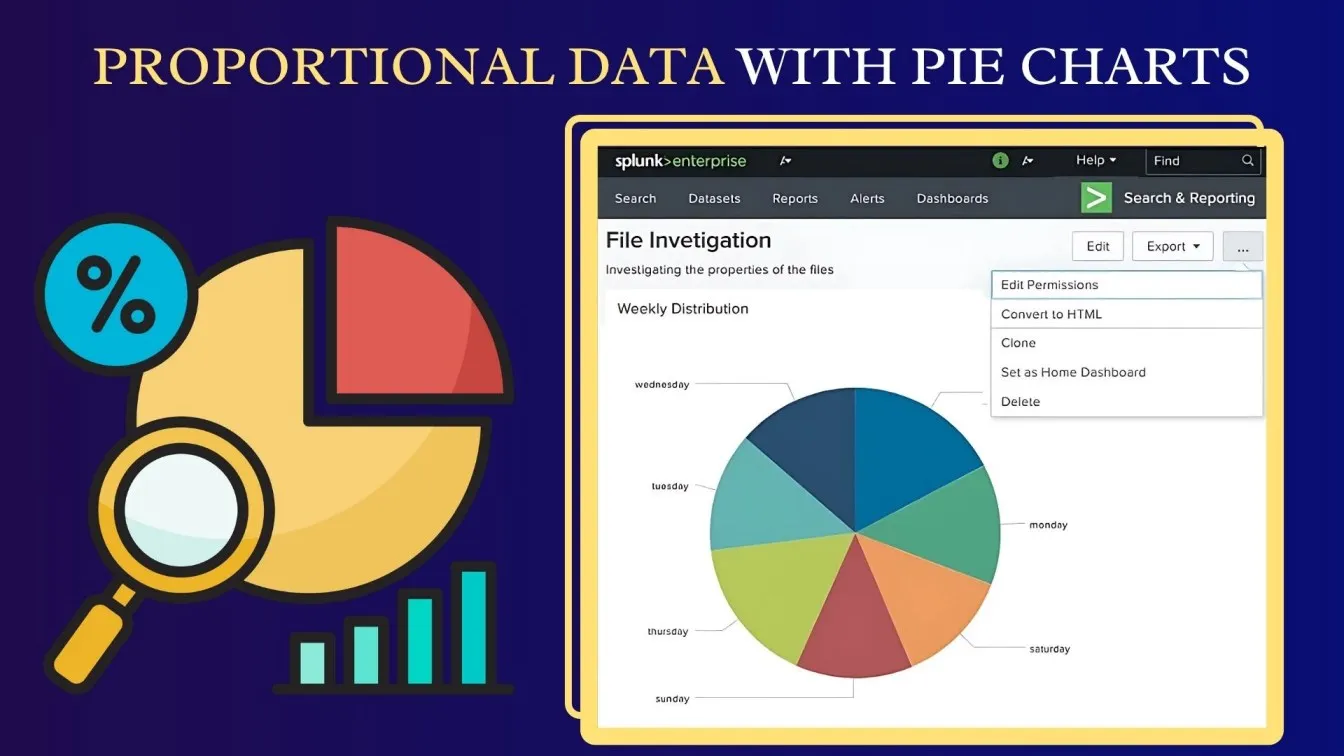
Why Use Pie Charts?
- Proportional Representation: Pie charts give a clear visual representation of each category's share of the total, making them useful for understanding distribution.
- Simple Comparisons: They are perfect for comparing a small number of categories at a glance, especially when categories are mutually exclusive.
- Easy to Digest: Pie charts simplify complex datasets into easy-to-understand visuals, making data interpretation faster.
In Splunk
Pie charts are great for visualizing traffic sources, user demographics, or server load distribution. They offer insights into the breakdown of categories, such as error types or sales channels, allowing Splunk users to quickly grasp the relative significance of each segment in the dataset.
Using Gauge Charts for Threshold-Based Monitoring
Gauge charts are perfect for visualizing performance metrics against a defined threshold, making them ideal for monitoring systems in real-time. They display data in a radial form, showing how a particular metric is performing relative to set limits.
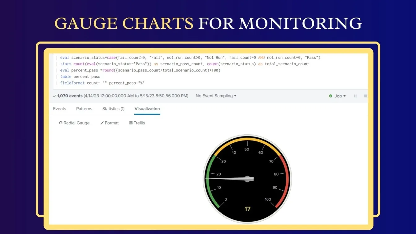
Why Use Gauge Charts?
- Threshold Visualization: Gauge charts support website performance optimization by tracking metrics like server health, response time, or system load against predefined thresholds.
- Instant Feedback: They offer an immediate visual representation of whether the metric is within the desired range or if action is needed.
- Easy Interpretation: The color-coded segments (green, yellow, red) help to quickly identify the status of a metric, ensuring rapid decision-making.
In Splunk
Gauge charts in Splunk are useful for monitoring real-time data such as CPU usage, memory consumption, or transaction volume. They help quickly highlight if values fall within a normal range or if they exceed warning or critical thresholds, enabling proactive intervention.
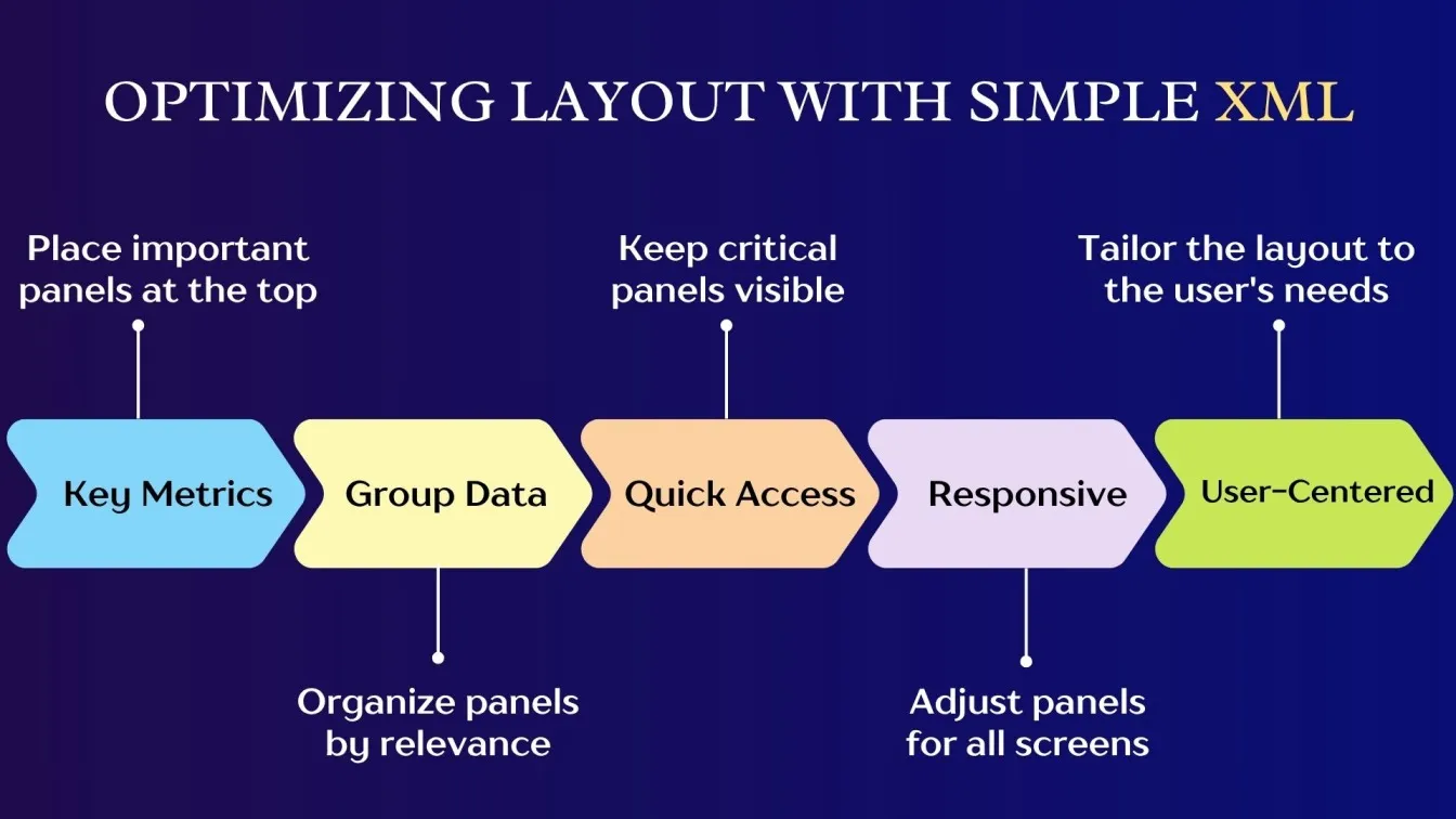
Best Practices for Splunk Dashboard Layout and Structure
A well-structured dashboard layout in Splunk is key to ensuring that users can efficiently access and analyze data. Adopting best practices for the dashboard layout ensures an intuitive, user-friendly design that enhances decision-making. Here are some key principles to follow when designing Splunk dashboards:
- Prioritize Key Information
Start by displaying the most important data at the top or center of the dashboard. This includes high-level metrics that drive critical decision-making, ensuring they are easily accessible to users at a glance.
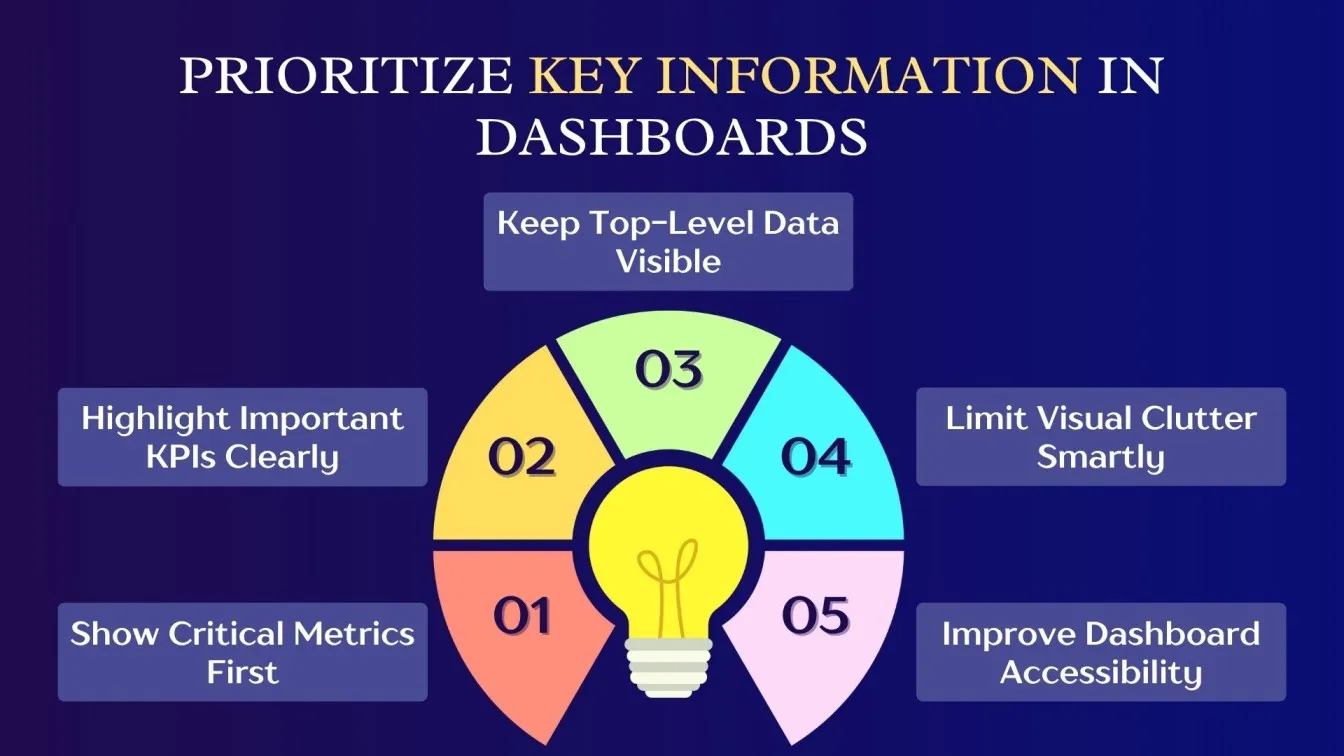
- Maintain Visual Hierarchy
Organize your dashboard into distinct sections based on relevance. Place key performance indicators (KPIs) at the top, followed by supporting visualizations. Group related charts together, allowing users to quickly compare data across different parameters. - Consistency in Design
Maintain consistency in colors, fonts, and layout across the dashboard. Use a unified color scheme to differentiate between critical and non-critical data. Consistency ensures a smoother user experience and reduces confusion. - Use Interactive Elements
Integrate interactive features like drilldowns, filters, and time selectors. Allow users to explore data more deeply and customize their views based on specific requirements. - Optimize for Performance
Ensure the dashboard loads quickly by reducing unnecessary panels and visualizations. Optimize queries for web performance optimization, especially in large data environments, to enhance content performance optimization.
Dashboard Configuration Techniques in Splunk
Effective dashboard configuration is essential for delivering a customized, interactive, and user-friendly experience in Splunk. By utilizing tools like Simple XML tokens, users can create dynamic dashboards that meet specific needs and preferences. These configuration techniques allow for personalized layouts and responsive interactions, ensuring that data is presented in the most useful and accessible way.
Customizing Layouts with Simple XML
Customizing layouts with Simple XML in Splunk gives you the flexibility to design dashboards that meet your specific requirements. This approach allows for a dynamic and tailored dashboard layout, ensuring better usability and a more engaging user experience.
- Panel Arrangement: Customize the placement of dashboard panels to highlight key metrics and make information easier to access.
- Styling and Themes: Enhance visual appeal by applying custom styles and themes that align with your organization’s branding.
- Flexible Controls: Add dropdowns, buttons, and input fields for interactive dashboards that allow users to filter and explore data.
- Consistency: Maintain uniformity across dashboards by using reusable layout templates, ensuring consistency in design.
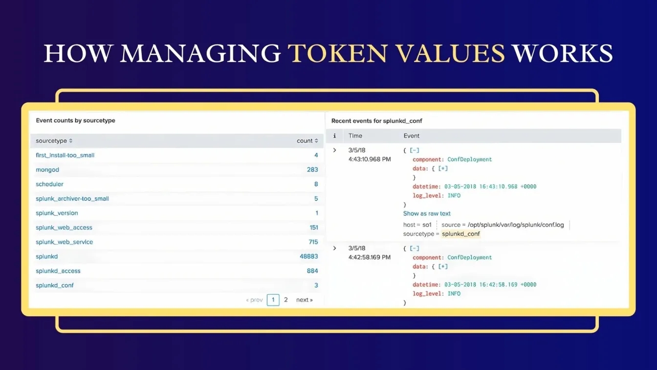
Using Tokens to Create Interactive Dashboards
Tokens in Splunk dashboards enable real-time interaction, offering users the ability to filter and manipulate data dynamically for tailored insights.
- Dynamic Filtering: Use tokens to allow users to filter data based on their selections, like date ranges or categories.
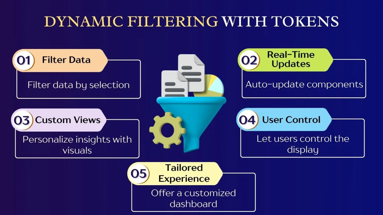
- Interactive Data: Automatically update dashboard components when a token value changes.
- Custom Visualizations: Display different visualizations depending on token values, offering personalized views of the data.
- Improved User Control: Empower users to interact with the dashboard and explore specific data subsets with ease.
Optimizing Splunk Dashboard Performance
Optimizing Splunk dashboard performance is essential for fast load times, efficient data retrieval, and smooth user interaction, especially with large datasets or real-time analytics. Best practices shared in the Splunk Community - Dashboards help users fine-tune performance, enabling quicker access to actionable insights without delays.
- Efficient Searches: Use summary indexing and scheduled searches to pre-process data, reducing query execution time for faster results.
- Minimize Data Overload: Avoid overwhelming the dashboard with too much data. Apply filters and display only relevant data points to improve load times.
- Use Panel Caching: Enable caching for commonly used panels to reduce the number of backend queries and speed up data retrieval.
- Optimize Queries: Streamline your SPL queries by minimizing unnecessary fields and ensuring that indexed fields are used for faster searches.
- Reduce Visual Complexity: Simplify the design by limiting the number of panels or using lightweight visualizations, thus reducing processing time and improving user experience.
Enhancing Splunk Dashboard Interactivity with Tokens and Drilldowns
Enhancing Splunk dashboard interactivity using tokens and drilldowns provides users with dynamic, interactive experiences, allowing them to explore data in greater detail and gain deeper insights.
- Tokens for Interactivity: Tokens allow dashboards to dynamically update based on user input. For example, selecting a value in a dropdown list can update the entire dashboard with corresponding data.
- Drilldowns for Detailed Analysis: Drilldowns enable users to click on a specific data point (e.g., a bar in a chart) and be redirected to another dashboard or panel with more detailed information about that data point.
- Cross-Browser Interactivity: Use tokens to link multiple panels on a dashboard, allowing them to update simultaneously based on user selection in one panel.
- Customizable Filters: Implement interactive filters with tokens to narrow down data, enabling users to focus on specific time ranges or categories without reloading the entire dashboard.
- Real-Time Data Updates: Tokens can also be used to reflect real-time data updates on dashboards. As new data comes in, the dashboard adjusts instantly, providing users with up-to-date insights without the need to refresh the page.
Common Mistakes to Avoid in Splunk Dashboards
Creating an effective Splunk dashboard requires careful attention to avoid common mistakes that could hinder user experience and data interpretation.
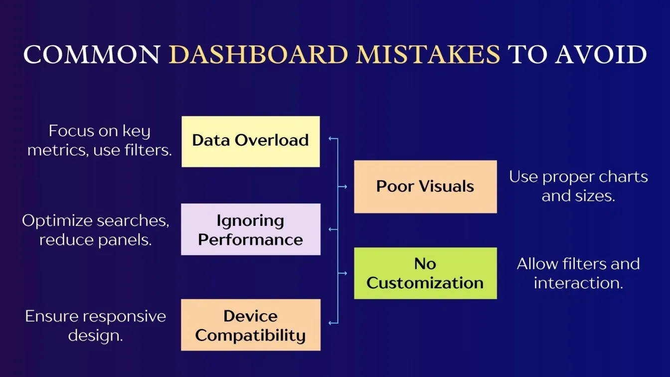
- Overloading with Data: Displaying too much data in one dashboard can overwhelm users. Focus on key metrics and use filters or drilldowns to keep the dashboard clean and easy to navigate.
- Poor Visualizations: Using the wrong charts or ignoring display sizes can confuse users. Follow Dashboard Design and Best Practices to choose suitable visualizations.
- Ignoring Performance: Dashboards that take too long to load can lead to a poor user experience. Optimize your searches and reduce the number of panels to improve performance.
- Lack of User Customization: Failing to provide options for user interaction, such as filters or date range selectors, can limit the dashboard’s flexibility. Make dashboards interactive to allow users to explore data based on their needs.
- Device Compatibility: Dashboards not optimized for different devices may perform poorly on mobile or smaller screens. Ensure responsive design for a better experience across all platforms.
Conclusion: Designing Dashboards That Deliver Insights
In conclusion, effective Splunk dashboard design transforms complex data into clear insights. Following Best Practices for dashboard design and using tools like Dashboard Studio and Splunk Observability Cloud helps users spot trends and make better decisions.
Choosing the right visualizations—like color meter visualizations for thresholds or time series for trends—plus optimizing performance and adding interactivity through drilldown search and filters, makes dashboards more engaging. Avoid unnecessary dashboards, use base search, default values, absolute layout, and adjust display sizes for a better user experience.
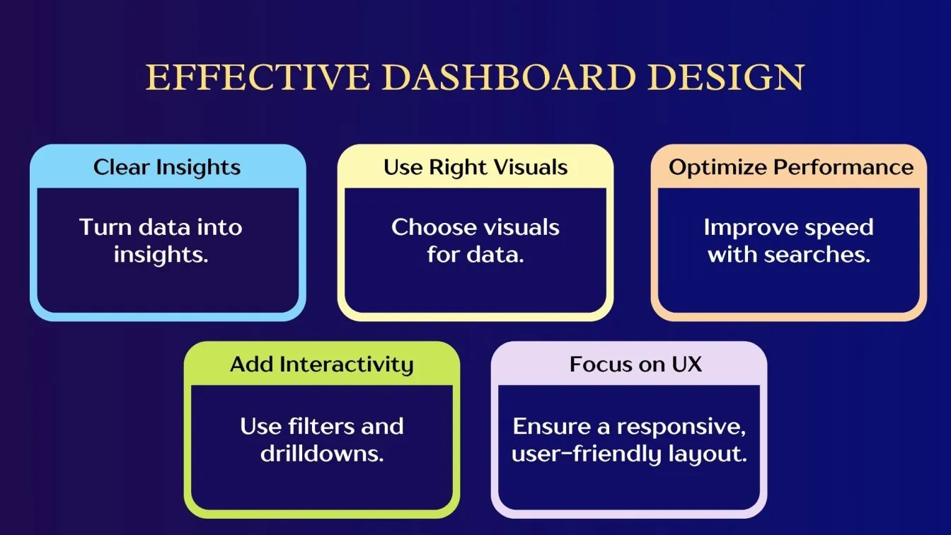
Refining dashboard cover design using Splunk Community and best practices for dashboard design ensures value. Strong visualization of data and timeline visualization highlight the importance of data visualization. Good user experience design services help improve user experience.
Frugal Testing is a leading SaaS application testing company known for its AI-driven test automation services. Among the services offered by Frugal Testing are cloud-based test automation services that help businesses improve testing efficiency, ensure software reliability, and achieve cost-effective, high-quality product delivery.
People Also Ask
How to secure access to Splunk dashboards?
To secure dashboards, set appropriate role-based permissions in Splunk's access controls to ensure only authorized users can view or edit specific dashboards.
Best practices for grouping panels in Splunk?
Group related panels together, maintain sufficient spacing, and use rows/columns to create a clean and organized layout.
How to handle large datasets in Splunk?
Use summary indexing, limit the time range, and focus on specific fields to optimize searches and handle large datasets efficiently.
How to manage user access and data restrictions in Splunk dashboards?
Set field-level permissions and use search filters based on roles to ensure users only see data they can access.
How to schedule automated reports from Splunk dashboards?
Use Splunk's alerting and scheduled report features to automatically deliver dashboard data via email or saved reports regularly.